Let me start by saying that I have very little skill when it comes to drawing, design and art. Put it this way, I once showed a diagram and someone recommended using a specific tool... the very tool that I used to create that diagram! So I've always tried my best when it comes to designing something, but just make as best that I can do.
Take for example our older The Beer Farmers logo:

I think it could be fair to say it could have been improved. And that it did! Scott McGready, who has far more talent that I have, come up with this beauty:

I know which one I would certainly pick! So where am I going with this? Well I've recently started my streaming again. And as a part of this I've put in some effort around the design of things such as the video overlays. During this process I thought that it might be time to create a new logo for myself. If you have been following me, you would recognise this logo that Hax Shax kindly created for me (again someone with far more talent than myself):
Now this logo served me well for numerous years, and I still love it. But as part of the streaming, let's just call "branding" but more of a theme, I really love the colours of this very blog. The blue and pink I think help create a bit of a pop. So I wanted to update the steaming content with these colours as well. This then would make the above logo look out of place. Another reason is that I may want to adapt it over time, so having access to the raw source would allow me to do that.
So off I went, and tried to create my own very logo. And this was the result:
New logo that I've created. My artistic skills are, let's just say challenged, so go easy on me 😂 pic.twitter.com/T3JaNGAVyC
— Sean Wright (@SeanWrightSec) April 9, 2022
Personally I was quite pleased with how it turned out, but being someone with quite limited skills who am I to know? I was quite surprised by the positive comments that it received (as well as appreciative of them). So this leads me onto the purpose of this post. Using the right tools means goes a long way to help those without the artistic skills that others have.
So how did I do it? Well I use a great platform for my streaming (which I will blog about my setup at some point), called streamlabs. It has a host of features which I highly recommend you have a look at, such as the ability to create themes for your streams. But one feature it provides is their Logo Maker. So I decided to give it a go. The first step was to decide which template to use. It didn't take long and I just knew this was the one for me!
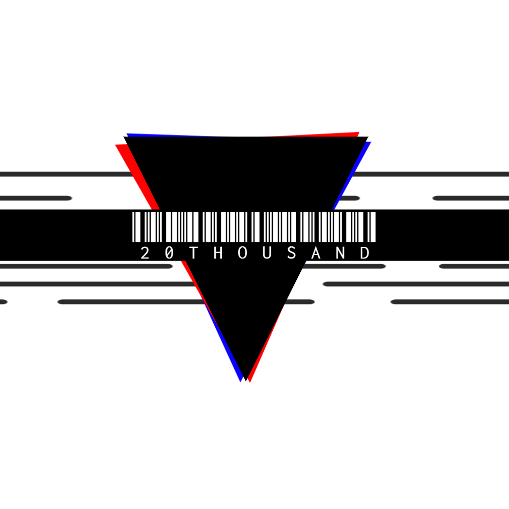
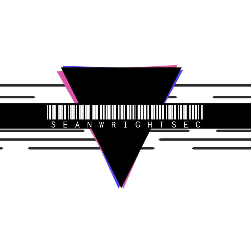
As the name says above, the template is called 20thousand. So I went about attempting modify to fit my needs. First off was adapting the colour to fit the colour scheme of this blog, and of course updating the title of the logo:
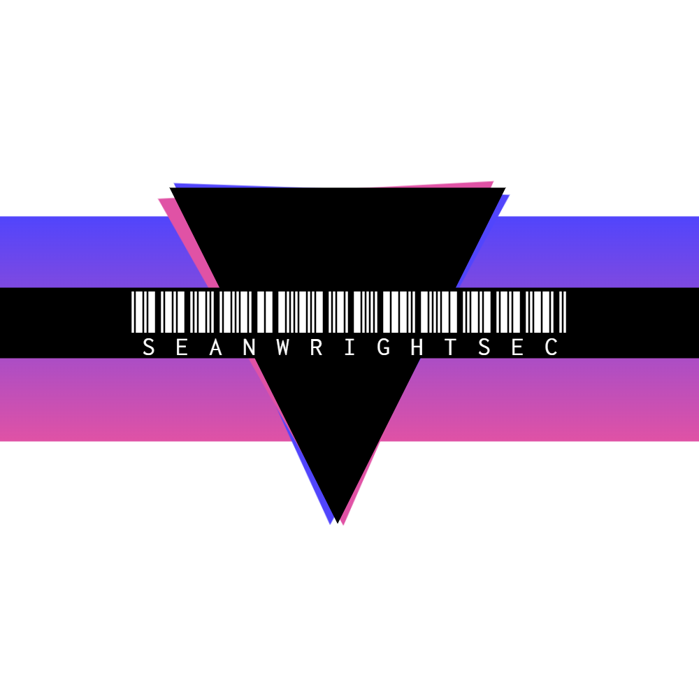
Starting to look good, the next step was to play around with the background grey block. A bit of playing around I thought about setting a gradient:
So looking even better, it was still missing something, so I tried with different symbols, and settled on the rat and came up with the final version:
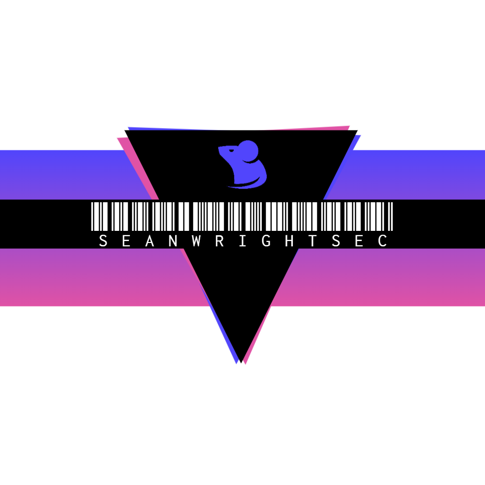
Editing the image in Gimp allowed me to add different background colours:
So there you have it, a story of how I created my own very logo! I'll create another blog post with the details of how I created the overlays for my stream (something that I'll be showcasing next week so will be doing it after that). I hope that this has proved helpful for others to be able to go out and be able to create their very own logos!


